
Overview
You will learn
- How to use the
ShellBarcomponent - How to use the
AnalyticalTablecomponent - How to style components


Prerequisites
Steps
Intro
So far, you have built your first Card component. Now to take things further, it’s time to build something bigger. In this step, you will learn how different components work together by building an analytical dashboard.
To make things easier, first import all the components and enums you will need in this step. Just copy the code below and replace the previous imported components in MyApp.tsx.
import {
   Avatar,
   Card,
   CardHeader,
   Text,
   ShellBar,
   ShellBarItem,
   List,
   ListItemStandard,
   ListItemCustom,
   ProgressIndicator,
   FlexBox,
   FlexBoxJustifyContent,
   FlexBoxWrap,
   FlexBoxDirection,
   AnalyticalTable,
   Icon,
} from "@ui5/webcomponents-react";The ShellBar is the central navigation element in your Web Application and should therefore be visible on all pages.
Again, you can try it out in the Storybook.
Start with adding the
ShellBarabove yourCardcomponent and add aprimaryTitleprop.TypeScript<ShellBar primaryTitle="My App" />Add some more properties
The logo of the application should be displayed and also a profile picture would be nice.
Use the
logoandprofileprop to achieve this. Thelogoprop accepts either animgtag or theAvatarcomponent, theprofileprop only accepts theAvatarcomponent. First add thelogoprop like this:TypeScript<ShellBar logo={<img src="" alt="Company Logo" />} primaryTitle="My App" />Then pass the
profileprop like this:TypeScript<ShellBar logo={<img src="" alt="Company Logo"/>} profile={<Avatar><img src="" alt="User Avatar" /></Avatar>} primaryTitle="My App" />You can use your own image, use a URL to an image or simply download the images below and add them inside your
srcfolder and then import them.Processed Assets:
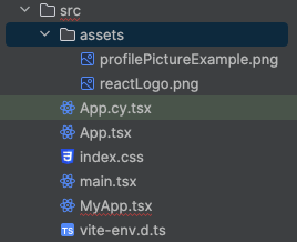
assets TypeScriptimport reactLogo from "./assets/reactLogo.png"; import profilePictureExample from "./assets/profilePictureExample.png";TypeScript<ShellBar logo={<img src={reactLogo} alt="Company Logo" />} profile={ <Avatar> <img src={profilePictureExample} alt="User Avatar" /> </Avatar> } primaryTitle="My App" />Add custom items
By passing a
ShellBarItemaschildyou are able to add custom items to yourShellBar. The element is basically aButtonwith responsive behavior and styling adapted to theShellBar.TypeScript<ShellBar logo={<img src="reactLogo.png" />} profile={ <Avatar> <img src="profilePictureExample.png" /> </Avatar> } primaryTitle="My App" > <ShellBarItem icon="activate" text="Activate" tooltip="activate" /> </ShellBar>That is strange – when you render your component, the
ShellBarItemis not shown.Every
Iconthat is used in a component has to be imported manually. All available icons can be found here.Add this line to your imports:
TypeScriptimport activateIcon from "@ui5/webcomponents-icons/dist/activate.js";Now your
ShellBarItemshows up on the right side of theShellBar.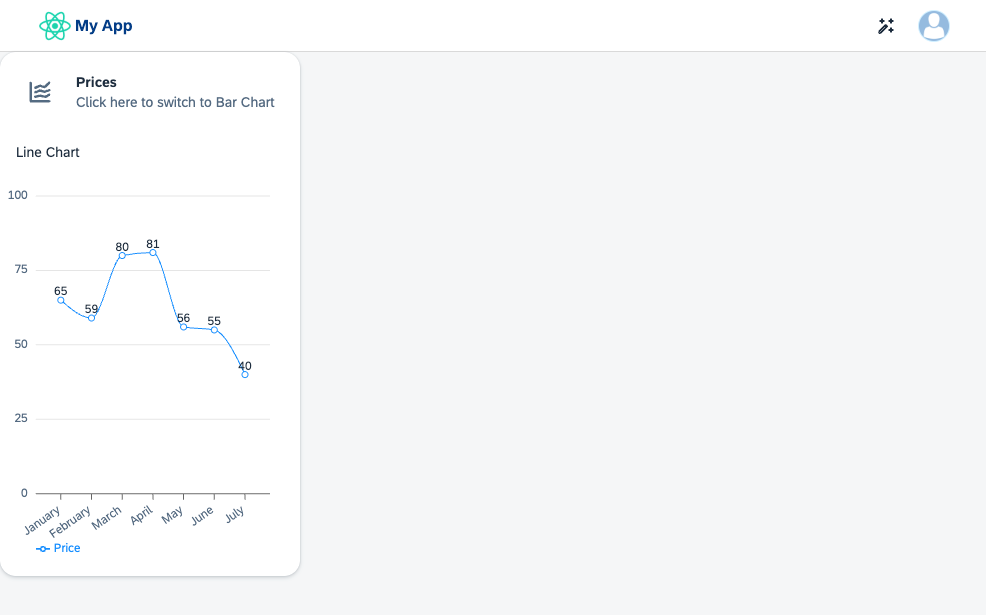
ShellBar For maintainability reasons, replace
icon="activate"with the import nameicon={activateIcon}. Now if you replace the icon but forget to remove the import, modern IDEs or linters like eslint will tell you that there is an unused import in your file.


Your component should now look like this:
import activateIcon from "@ui5/webcomponents-icons/dist/activate.js";
import lineChartIcon from "@ui5/webcomponents-icons/dist/line-chart.js";
import barChartIcon from "@ui5/webcomponents-icons/dist/horizontal-bar-chart.js";
import { useState } from "react";
import {
Avatar,
Card,
CardHeader,
Text,
ShellBar,
ShellBarItem,
List,
ListItemStandard,
ListItemCustom,
ProgressIndicator,
FlexBox,
FlexBoxJustifyContent,
FlexBoxWrap,
FlexBoxDirection,
AnalyticalTable,
Icon,
} from "@ui5/webcomponents-react";
import { BarChart, LineChart } from "@ui5/webcomponents-react-charts";
import reactLogo from "./assets/reactLogo.png";
import profilePictureExample from "./assets/profilePictureExample.png";
const dataset = [
{
month: "January",
data: 65,
},
{
month: "February",
data: 59,
},
{
month: "March",
data: 80,
},
{
month: "April",
data: 81,
},
{
month: "May",
data: 56,
},
{
month: "June",
data: 55,
},
{
month: "July",
data: 40,
},
];
export function MyApp() {
const [toggleCharts, setToggleCharts] = useState("lineChart");
const [loading, setLoading] = useState(false);
const contentTitle =
toggleCharts === "lineChart" ? "Line Chart" : "Bar Chart";
const switchToChart =
toggleCharts === "lineChart" ? "Bar Chart" : "Line Chart";
const handleHeaderClick = () => {
if (toggleCharts === "lineChart") {
setLoading(true);
setTimeout(() => {
setLoading(false);
setToggleCharts("barChart");
}, 2000);
} else {
setLoading(true);
setTimeout(() => {
setLoading(false);
setToggleCharts("lineChart");
}, 2000);
}
};
return (
<div>
<ShellBar
logo={<img src={reactLogo} alt="Company Logo" />}
profile={
<Avatar>
<img src={profilePictureExample} alt="User Avatar" />
</Avatar>
}
primaryTitle="My App"
>
<ShellBarItem icon={activateIcon} text="Activate" />
</ShellBar>
<Card
header={
<CardHeader
titleText="Prices"
subtitleText={`Click here to switch to ${switchToChart}`}
interactive
avatar={
<Icon
name={
toggleCharts === "lineChart" ? lineChartIcon : barChartIcon
}
accessibleName={contentTitle}
/>
}
onClick={handleHeaderClick}
/>
}
style={{ width: "300px" }}
>
<Text style={{ padding: "var(--sapContent_Space_S)" }}>
{contentTitle}
</Text>
{toggleCharts === "lineChart" ? (
<LineChart
dimensions={[{ accessor: "month" }]}
measures={[{ accessor: "data", label: "Price" }]}
dataset={dataset}
loading={loading}
/>
) : (
<BarChart
dimensions={[{ accessor: "month" }]}
measures={[{ accessor: "data", label: "Price" }]}
dataset={dataset}
loading={loading}
/>
)}
</Card>
</div>
);
}To wrap the
Listadd aCard(right after the first one).TypeScript<Card header={ <CardHeader titleText="Progress" subtitleText="List" avatar={<Icon name={listIcon} />} /> } style={{ width: "300px" }} ></Card>Add the list
Iconto your imports.TypeScriptimport listIcon from "@ui5/webcomponents-icons/dist/list.js";Add the
Listcomponent as child of theCard.TypeScript<List></List>To render elements of the list, use the
ListItemStandardand pass astringas child.TypeScript<List> <ListItemStandard>Activity 1</ListItemStandard> </List>Users should know the status of the activities. Add the
additionalTextprop to theStandardListItem. To visualize if the status is neutral, positive or negative, also add theadditionalTextStateprop.You can either pass a supported string directly, or use the
ValueStateenum:TypeScriptimport ValueState from '@ui5/webcomponents-base/dist/types/ValueState.js';TypeScript<ListItemStandard additionalText="finished" additionalTextState={ValueState.Positive} > Activity 1 </ListItemStandard> <ListItemStandard additionalText="failed" additionalTextState={ValueState.Negative} > Activity 2 </ListItemStandard>The “Progress” card shows two list items, but both of them are already completed. Let’s create two more activities which are still in progress.
First, create two
ListItemCustoms below the completed items.TypeScript<ListItemCustom></ListItemCustom> <ListItemCustom></ListItemCustom>The
ListItemCustomallows customizing the content of the list item and for this reason doesn’t offer props likeadditionalText.To show the progress, add the
ProgressIndicatoras child of the items, with the following props:value: The value, which indicates the progressvalueState: The value-state (color) of the indicator
TypeScript<ListItemCustom> <ProgressIndicator value={89} valueState={ValueState.Positive} /> </ListItemCustom> <ListItemCustom> <ProgressIndicator value={5} valueState={ValueState.Negative} /> </ListItemCustom>The indicators are displayed as part of the list item, but the title and status of the activities is still missing. For this, add two
Textcomponents above the indicator:TypeScript<ListItemCustom> <Text>Activity 3</Text> <Text>in progress</Text> <ProgressIndicator value={89} valueState={ValueState.Positive} /> </ListItemCustom>All necessary information are now available in each item, but the formatting looks terrible. Let’s fix that by using a flex-box:
TypeScript<ListItemCustom> <FlexBox direction={FlexBoxDirection.Column} fitContainer> <FlexBox justifyContent={FlexBoxJustifyContent.SpaceBetween}> <Text>Activity 3</Text> <Text>in progress</Text> </FlexBox> <ProgressIndicator value={89} valueState={ValueState.Positive} /> </FlexBox> </ListItemCustom>The
FlexBoximplements most of theCSS Flexboxbehavior without being forced to actually use CSS or other styling methods.The content of the list item is now aligned correctly, but doesn’t apply the correct padding, colors and dimensions. To fix this as well, pass the
styleprop, to use the default ReactinlineStylesyntax. Again, we’re using global CSS variables for this:TypeScript<ListItemCustom> <FlexBox direction={FlexBoxDirection.Column} fitContainer style={{ paddingBlock: "var(--sapContent_Space_S)" }} > <FlexBox justifyContent={FlexBoxJustifyContent.SpaceBetween}> <Text style={{ fontSize: "var(--sapFontLargeSize)" }}> Activity 3 </Text> <Text style={{ color: "var(--sapCriticalTextColor)" }}> in progress </Text> </FlexBox> <ProgressIndicator value={89} valueState={ValueState.Positive} style={{ marginBlockStart: "0.5rem" }} /> </FlexBox> </ListItemCustom>Finally, apply the same layout and styles to the content of the second
ListItemCustom.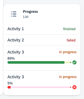
List
The last tile should contain a
AnalyticalTablecomponent. Again, create aCardto wrap the Table and set themax-widthto900px.TypeScript<Card header={ <CardHeader titleText="AnalyticalTable" avatar={<Icon name={tableViewIcon} />} /> } style={{ maxWidth: "900px" }} > <AnalyticalTable /> </Card>Also import the
table-viewIcon.TypeScriptimport tableViewIcon from "@ui5/webcomponents-icons/dist/table-view.js";Add data and columns to the table. The
columnsprop expects an array of objects that include at least theaccessorto the data or a uniqueidproperty. The value ofHeaderwill be shown as column header.You can create your own data or just use the code below and paste it right after the definition of the
datasetof the chart.TypeScriptconst tableData = new Array(500).fill(null).map((_, index) => { return { name: `name${index}`, age: Math.floor(Math.random() * 100), friend: { name: `friend.Name${index}`, age: Math.floor(Math.random() * 100) } }; }); const tableColumns = [ { Header: "Name", accessor: "name" // String-based value accessors! }, { Header: "Age", accessor: "age" }, { Header: "Friend Name", accessor: "friend.name" }, { Header: "Friend Age", accessor: "friend.age" } ];Display the data by replacing the current table with.
TypeScript<AnalyticalTable data={tableData} columns={tableColumns} />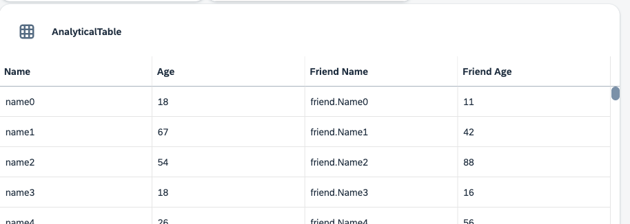
Table Add more properties
You can add many more properties to the
AnalyticalTablecomponent. For example, you can allow sorting, filtering and grouping viasortable,filterableandgroupable, enable different selection modes withselectionMode, control how the table splits up available space between the columns withscaleWidthModeand many more. Feel free to take a look at the documentation and explore the different examples before continuing.The default visible rows count is at 15. This number is a bit to high for a dashboard table. Reduce the
visibleRowscount to 5 by setting the corresponding prop.TypeScript<AnalyticalTable data={tableData} columns={tableColumns} visibleRows={5}/>
At the moment, the dashboard doesn’t really look like a dashboard. The components are way too close to each other and not aligned correctly. Let’s change that.
Add margin to each
CardTo add a margin to the cards, you can use the global CSS vars again:
TypeScript<Card header={ <CardHeader titleText="Stock Prices" ... /> } style={{ width: "300px", margin: "var(--sapContent_Margin_Small)" }} >TypeScript<Card header={ <CardHeader titleText="Progress" ... /> } style={{ width: "300px", margin: "var(--sapContent_Margin_Small)" }} >TypeScript<Card header={ <CardHeader titleText="AnalyticalTable" ... /> } style={{ maxWidth: "900px", margin: "var(--sapContent_Margin_Small)" }} >Align the elements
To properly align the tiles, use a
FlexBoxcomponent and wrap yourCardsinside of it. Use thejustifyContentprop to center align all elements andwrapto make them move to the next line if not enough space is available, also apply thestyleprop to add a padding to the whole content area.TypeScript<FlexBox justifyContent={FlexBoxJustifyContent.Center} wrap={FlexBoxWrap.Wrap} style={spacing.sapUiContentPadding} ... </FlexBox>Note: You could also use the
gapprop of theFlexBoxcomponent to apply the spacing.
Your component should now look like this:

import tableViewIcon from "@ui5/webcomponents-icons/dist/table-view.js";
import listIcon from "@ui5/webcomponents-icons/dist/list.js";
import activateIcon from "@ui5/webcomponents-icons/dist/activate.js";
import lineChartIcon from "@ui5/webcomponents-icons/dist/line-chart.js";
import barChartIcon from "@ui5/webcomponents-icons/dist/horizontal-bar-chart.js";
import { useState } from "react";
import {
Avatar,
Card,
CardHeader,
Text,
ShellBar,
ShellBarItem,
List,
ListItemStandard,
ListItemCustom,
ProgressIndicator,
FlexBox,
FlexBoxJustifyContent,
FlexBoxWrap,
FlexBoxDirection,
AnalyticalTable,
Icon,
} from "@ui5/webcomponents-react";
import { BarChart, LineChart } from "@ui5/webcomponents-react-charts";
import reactLogo from "./assets/reactLogo.png";
import profilePictureExample from "./assets/profilePictureExample.png";
import ValueState from "@ui5/webcomponents-base/dist/types/ValueState.js";
const tableData = new Array(500).fill(null).map((_, index) => {
return {
name: `name${index}`,
age: Math.floor(Math.random() * 100),
friend: {
name: `friend.Name${index}`,
age: Math.floor(Math.random() * 100),
},
};
});
const tableColumns = [
{
Header: "Name",
accessor: "name", // String-based value accessors!
},
{
Header: "Age",
accessor: "age",
},
{
Header: "Friend Name",
accessor: "friend.name",
},
{
Header: "Friend Age",
accessor: "friend.age",
},
];
const dataset = [
{
month: "January",
data: 65,
},
{
month: "February",
data: 59,
},
{
month: "March",
data: 80,
},
{
month: "April",
data: 81,
},
{
month: "May",
data: 56,
},
{
month: "June",
data: 55,
},
{
month: "July",
data: 40,
},
];
export function MyApp() {
const [toggleCharts, setToggleCharts] = useState("lineChart");
const [loading, setLoading] = useState(false);
const contentTitle =
toggleCharts === "lineChart" ? "Line Chart" : "Bar Chart";
const switchToChart =
toggleCharts === "lineChart" ? "Bar Chart" : "Line Chart";
const handleHeaderClick = () => {
if (toggleCharts === "lineChart") {
setLoading(true);
setTimeout(() => {
setLoading(false);
setToggleCharts("barChart");
}, 2000);
} else {
setLoading(true);
setTimeout(() => {
setLoading(false);
setToggleCharts("lineChart");
}, 2000);
}
};
return (
<div>
<ShellBar
logo={<img src={reactLogo} alt="Company Logo" />}
profile={
<Avatar>
<img src={profilePictureExample} alt="User Avatar" />
</Avatar>
}
primaryTitle="My App"
>
<ShellBarItem icon={activateIcon} text="Activate" />
</ShellBar>
<FlexBox
justifyContent={FlexBoxJustifyContent.Center}
wrap={FlexBoxWrap.Wrap}
style={{ padding: "var(--sapContent_Space_M)" }}
>
<Card
header={
<CardHeader
titleText="Prices"
subtitleText={`Click here to switch to ${switchToChart}`}
interactive
avatar={
<Icon
name={
toggleCharts === "lineChart" ? lineChartIcon : barChartIcon
}
accessibleName={contentTitle}
/>
}
onClick={handleHeaderClick}
/>
}
style={{ width: "300px", margin: "var(--sapContent_Margin_Small)" }}
>
<Text style={{ padding: "var(--sapContent_Space_S)" }}>
{contentTitle}
</Text>
{toggleCharts === "lineChart" ? (
<LineChart
dimensions={[{ accessor: "month" }]}
measures={[{ accessor: "data", label: "Price" }]}
dataset={dataset}
loading={loading}
/>
) : (
<BarChart
dimensions={[{ accessor: "month" }]}
measures={[{ accessor: "data", label: "Price" }]}
dataset={dataset}
loading={loading}
/>
)}
</Card>
<Card
header={
<CardHeader
titleText="Progress"
subtitleText="List"
avatar={<Icon name={listIcon} />}
/>
}
style={{ width: "300px", margin: "var(--sapContent_Margin_Small)" }}
>
<List>
<ListItemStandard
  additionalText="finished"
  additionalTextState={ValueState.Positive}
>
  Activity 1
</ListItemStandard>
<ListItemStandard
  additionalText="failed"
  additionalTextState={ValueState.Negative}
>
  Activity 2
</ListItemStandard>
<ListItemCustom>
  <FlexBox
    direction={FlexBoxDirection.Column}
    fitContainer
    style={{ paddingBlock: "var(--sapContent_Space_S)" }}
  >
    <FlexBox justifyContent={FlexBoxJustifyContent.SpaceBetween}>
      <Text style={{ fontSize: "var(--sapFontLargeSize)" }}>
        Activity 3
      </Text>
      <Text style={{ color: "var(--sapCriticalTextColor)" }}>
        in progress
      </Text>
    </FlexBox>
    <ProgressIndicator
      value={89}
      valueState={ValueState.Positive}
      style={{ marginBlockStart: "0.5rem" }}
    />
  </FlexBox>
</ListItemCustom>
<ListItemCustom>
<FlexBox
direction={FlexBoxDirection.Column}
fitContainer
style={{ paddingBlock: "var(--sapContent_Space_S)" }}
>
<FlexBox justifyContent={FlexBoxJustifyContent.SpaceBetween}>
<Text style={{ fontSize: "var(--sapFontLargeSize)" }}>
Activity 3
</Text>
<Text style={{ color: "var(--sapCriticalTextColor)" }}>
in progress
</Text>
</FlexBox>
<ProgressIndicator
value={5}
valueState={ValueState.Negative}
style={{ marginBlockStart: "0.5rem" }}
/>
</FlexBox>
</ListItemCustom>
</List>
</Card>
<Card
header={
<CardHeader
titleText="AnalyticalTable"
avatar={<Icon name={tableViewIcon} />}
/>
}
style={{
maxWidth: "900px",
margin: "var(--sapContent_Margin_Small)",
}}
>
<AnalyticalTable
data={tableData}
columns={tableColumns}
visibleRows={5}
/>
</Card>
</FlexBox>
</div>
);
}Resources
Discussion
Share feedback on this tutorial or join the conversation in SAP Community.